
AI disclosure: Banner image generated using Google Gemini and reviewed by TMC staff prior to publication.
Humans are complicated creatures. There are billions of us. We move around a lot. We change our names, which are complicated even when we don’t change them—some people go by their middle name, some people don’t have middle names, and “Peg” is a nickname for Margaret.
The data about us is messy, too—we fill out forms incorrectly. We don’t give our Social Security numbers out to anyone who asks. We change our phone numbers and eventually stop checking limpbizkitfan2000@aol.com.
This makes working with human identity data challenging. But because answering any interesting question with data runs up against this human weirdness, it’s worth doing well!
For movement organizations, this challenge often shows up when trying to understand who their supporters are across different tools, campaigns, and datasets.
Our Approach
With all this in mind, we’ve spent the last few months building out some major improvements to the Identity Resolution (IDR) system that our members access as part of Compass, TMC’s member-exclusive data transformation layer. Compass brings together contact and engagement data from multiple tools into structured, usable tables—helping members better understand and demonstrate how they’re building power in their communities.
What we’ve built is a powerful system that draws on a fairly complex statistical model and utilizes data-engineering tooling to process tens of billions of rows in a way that should be flexible and accommodate changes through future waves of iteration and improvement.
Compass tables currently include references to hundreds of millions of what we call “profiles”—each profile represents some set of uniquely identified records within a vendor’s data. Here are a few examples:
| Vendor | Id | First Name | Last Name | Emails | Addresses | |
|---|---|---|---|---|---|---|
| A | Actblue | 1234 | Cody | Braun | cody@braun.com | 123 Elm St., 10000 State St. |
| B | Actblue | 5678 | Susan | susan@test.com | ||
| C | Action Kit | abcd | C. | Braun | 123 Elm Street |
With just a few rows, it’s pretty obvious that rows A and C probably refer to the same person. Those two profiles have a similar and relatively uncommon name, and they share a very similar address. But we need to build an algorithm that can learn these patterns at a very large scale if we’re going to help hundreds of organizations reconcile this kind of information.
Why Organizations Need IDR
Haven, TMC’s centralized data warehouse, allows members to sync dozens of the tools they use for events, outreach, advocacy, and fundraising into a single place. But if you refer to the table above, having a lot of data in one place doesn’t necessarily give you a complete picture of a single person’s entire history with your organization.
The same person who the Development team has on record as a $20 monthly recurring donor might be known to a staff organizer as a volunteer with a history of attending phone banks—6 in the last year! Little does either team know, the same donor/volunteer recently opted out of fundraising emails, but doesn’t mind getting sent event invitations and volunteering opportunities via text.
Any organization would be beyond lucky to have such an engaged supporter! So, how do you ensure that your organization not only has the correct information (like their most up-to-date address) to reach out to them, but also get to the lightbulb moment of this “donor/volunteer/no email fundraising/yes event texts” individual is the SAME person, who should be recognized by the organization for the richness of their contributions, not the fragments?
The first step is being able to accurately recognize when these fragmented inputs from multiple sources all refer to that single volunteer.
Introducing Splink
Splink is an open-source tool based on a series of academic papers that outline a statistical approach to the problem of IDR. It is an unsupervised approach—almost any machine learning model can be categorized as supervised or unsupervised.
A supervised model is “supervised” by a human in that it takes as input labeled data—in the case of IDR, that would be pairs of profiles along with some input like, “these represent the same person,” or, “these do not represent the same person.” Fitting a supervised model can be challenging because you need enough labeled data to cover most of a large universe of possible cases, and the model can inherit biases or errors from the human annotators. We experimented with some supervised models, but they struggled to handle the volume of our data.
An unsupervised model, like Splink, attempts to identify patterns in data without human annotation. The patterns that Splink learns from the data are fairly complex, but they boil down to this: which features are shared by pairs of profiles referring to the same person, such that we end up with a reasonable number of total people?
For example, let’s imagine we have 200 million profiles and believe they represent about 50 million real people. When we first attempt to fit the model, it might say, “Maybe every profile with country=USA represents the same person.” The model would observe that this produces far too few canonical people in the output and might try increasing the weight placed on email. This produces a much more correct universe, and it continues to iterate from there.
The Model
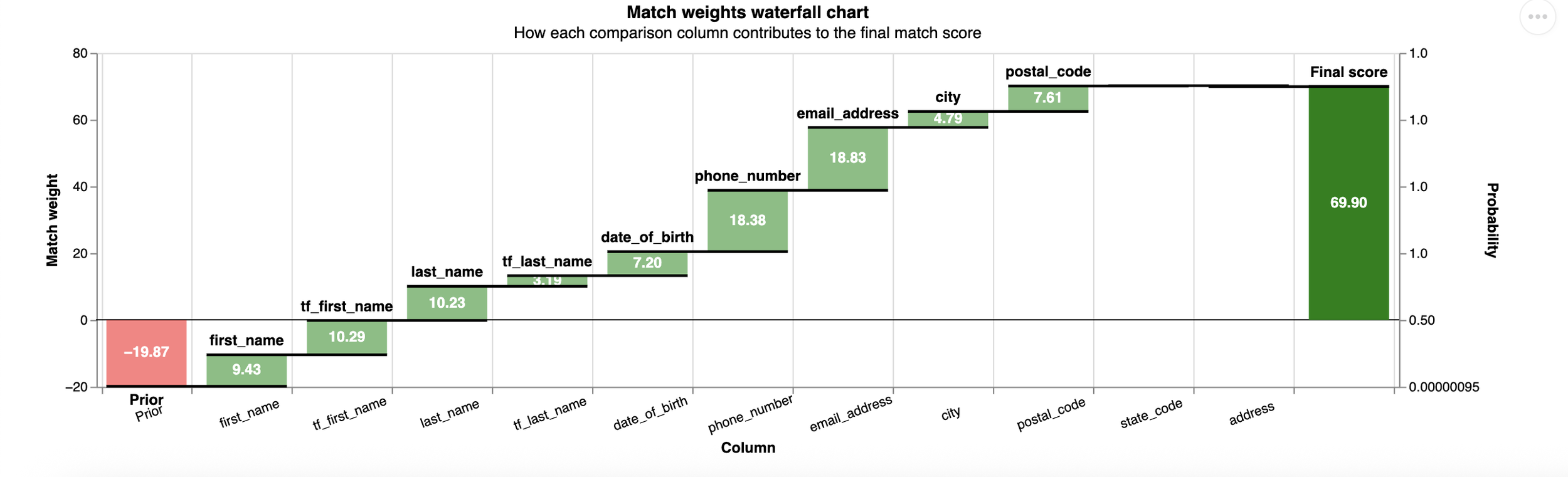
Here are the features that the model ultimately learns are important:
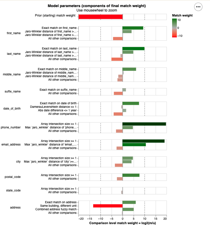
Chart generated using Splink, an open-source identity resolution tool, and reviewed by TMC staff prior to publication.
These are mostly fairly intuitive: two profiles with matching email addresses or phone numbers are much more likely to represent the same person. Our baseline prior is very low, meaning that if you select two random profiles from Compass, it’s very unlikely that they represent the same person.
A benefit of using a model like Splink is that it’s quite interpretable and parsimonious. That means that when we examine two profiles that the model either linked or did not link, we can easily explain why this happened. This is in contrast to more complex models, which can be total black boxes or even produce non-deterministic outputs.
These features also showcase how we’re handling similar but non-identical matches.
In our earlier example profiles, we had two probably-linked profiles with the addresses “123 Elm Street” and “123 Elm St.” A simple rules-based model would likely miss that match completely. These two profiles don’t have the same email, first name, or any matching street addresses.
We have configured levels of similarity for many columns such that we consider “identical address,” “meaningfully similar address,” or “totally different address.” Critically, Splink looks at all of the features of a pair holistically. A rules-based system might miss unusual cases, like two people who share an email address, while this system is able to take into consideration a wider variety of features.
String Similarity
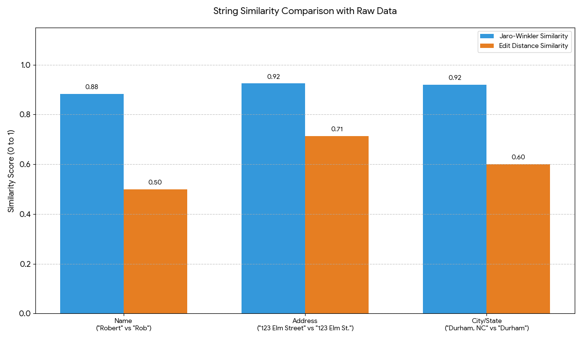
But what makes an address similar? There are a surprisingly large number of approaches to comparing two strings—the simplest method is edit distance, or the number of one-character changes you would make to the first string to get to the second one. However, identity data has some interesting properties.
Consider this person: “Robert” at “123 Elm Street” in “Durham, NC” versus “Rob” at “123 Elm St.” in “Durham.” In all those cases, we’re most interested in the fact that there is a significant matching prefix at the start of the string. This means that, for IDR cases, the most common choice is the Jaro-Winkler distance, a string similarity metric that prioritizes similar beginnings and works well for short strings such as names or addresses.
AI disclosure: Graph generated using Google Gemini and reviewed by TMC staff prior to publication.
Once we have settled on what constitutes “similarity” when comparing a name or street address, there is one more critical step: we weight the importance of that similarity by how common that value is across the entire dataset. The example pictured below shows a pair of profiles with very common first and last names (note the red bars for tf_first_name and tf_last_name, where “tf” is short for “term frequency”).
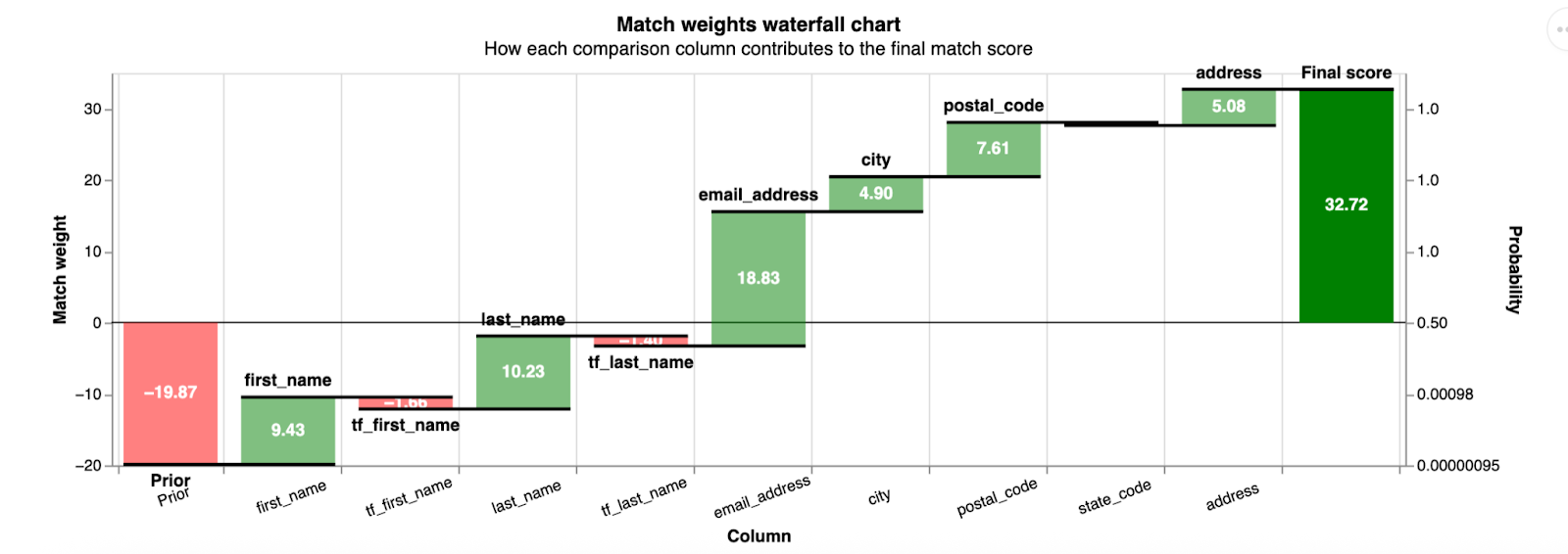
AI disclosure: Graph generated using Google Gemini and reviewed by TMC staff prior to publication.
Whereas in this case, we find a pair with less common names, leading to a higher total score and a higher probability of a match (note the green bars for the “tf” features).
AI disclosure: Graph generated using Google Gemini and reviewed by TMC staff prior to publication.
IDR Architecture
The comparison of any possible pair of matching profiles is perhaps the most interesting piece of the IDR system, but it wouldn’t be much good without two other pieces.
Blocking is the process by which we identify good pairs to compare. If we have 200 million profiles to compare, we couldn’t just compare every possible pair—that’d be 40,000,000,000,000,000 pairs. If we could do one comparison per second, this would still take more than one billion years to run. We’d probably like it to be much faster than that.
So we define a blocking strategy. Our strategy is to compare every pair with a matching first name and last name, a matching email, a matching phone number, or a matching street address. We know we’re still doing lots of unnecessary comparisons (multiple distinct humans often live at the same address or share a first name and last name), but that gets us down to 10s of billions of comparisons, and we can comfortably fit the model and run inference in a day. That’s much better!
The other important piece of this process is turning these “linkages”—the probability that any pair of two profiles represents the same person—into “clusters,” or the canonical set of humans that our model says exist. We also want to give each human a useful identifier. There is some transitive logic at work here, and Splink takes a simple iterative approach to turning the linkages into clusters.
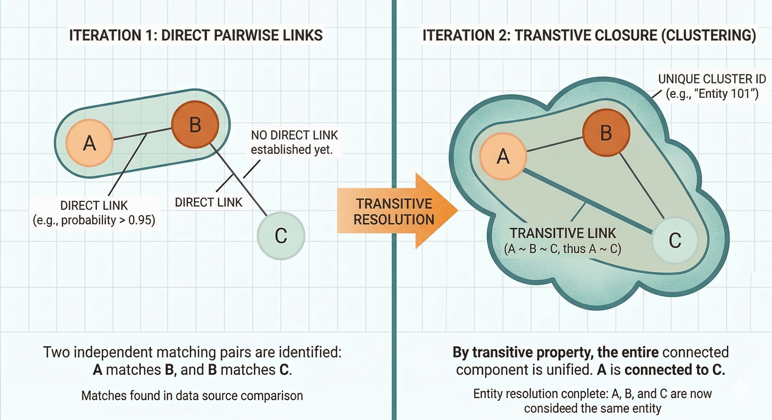
AI disclosure: Image generated using Google Gemini and reviewed by TMC staff prior to publication.
Critically, we can deploy all of this to an autoscaling Spark cluster using GCP Dataproc.
Spark is a framework built to distribute massive workloads across hardware. To understand why Spark is necessary, imagine you had a long list of numbers and wanted to find the maximum value. You could put it into a computer and have it tell you the max. But if the number is too large to fit in memory, you get a second computer.
Now you need some algorithm for dividing up the work and merging it again—something like “split the list in half, give half to each computer, have it output the max, then take the max of those two numbers.” Spark abstracts out all the complexity and lets you write simple SQL that divvies up the work (and then merges it) across potentially hundreds of machines under the hood.
This allows us to run the tens of billions of operations here quickly, while remaining confident that we can continue running the model efficiently as the data grows by scaling up the underlying hardware.
Performance and Future Work
To measure the model's performance, we’ve begun annotating pairs of profiles across the universe of Compass data. That entails having a human labeler mark hundreds of pairs with “should link” or “should not link.” We then compare the model's output to those labels. We have not completed this labeling, but initial results on a sample set are promising: we hit approximately 95% accuracy, 60% recall, and 86% precision.
To further validate the model, we’re also comparing what happens when we send all of the input profiles to an external service for matching to a voter file. If we find that the profiles within our clusters often have several distinct voter file IDs, that would be concerning.
Instead, our clusters have several profiles on average, and the matching service assigns them 0.5 voterfile IDs on average. That suggests we’re able to make some linkages using even sparsely populated profiles that an external voter file-matching service can’t handle, and we’re rarely in disagreement with the matching service.
We’ll continue refining this model's performance. There are a variety of additional features we could engineer (for example, it would be useful for us to have latitude and longitude for all the street addresses, and we could extract some geospatial information from phone area codes).
It’s also possible that, in the long term, the naive agglomerative approach Splink takes in building the clusters from linkages doesn’t serve us well. The approach for finding and scoring potential pairs must be very fast, given the size of the data. However, a model that took a more nuanced approach to building clusters from those edges could be more complex and slower, since it takes a much smaller set of inputs. By that stage, we’ve already done the heavy data lifting at that point.
We’ll also continue to iterate on how we expose these models to TMC members. There are a huge number of potential use cases, from simple joins across vendor datasets to broader program analysis.
Though human data is challenging to work with, it’s worth the effort—it helps us understand who we are, where we’ve been, and how to talk to us!
About the author

Cody Braun
Staff Data Engineer, The Movement Cooperative
Cody Braun (he/him) is a data engineer who has built large pipelines and small tech companies. He is a graduate of UNC Chapel Hill and the University of Chicago, currently based in Las Vegas. He has a six-month-old child and is doing his best—please excuse him if he seems sleep-deprived.
